DESIGN SYSTEM · B2B SAAS
One design system for two very different products
I joined Engaz AI in December 2024 as its product designer. I audited the CRM and HR products, then built one design system that themes both, with contrast fixed to WCAG 2.1.
COMPANY
Engaz AI
ROLE
Product Designer
TIMELINE
Dec 2024 – 2025
FOCUS
Design system, audit, accessibility
WORKED WITH
Engineering
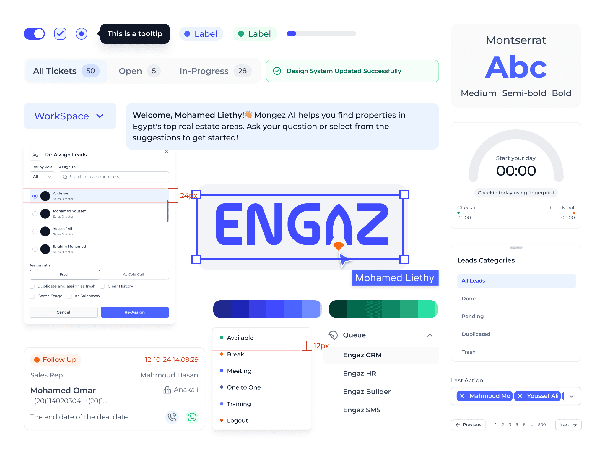
The Engaz design system: one set of components, themed for CRM and HR.
01
The challenge
Engaz has several products, and each one has its own style. Engaz CRM speaks blue and serves real estate teams. Engaz HR speaks green and serves CRM clients and other companies’ employees.
The challenge was designing one design system that works across all of these products.
02
The plan
I broke the work into six steps: audit the current design, fix the most critical areas first, refine existing components for consistency, fix interaction issues, define the structure of the design system, and document components and guidelines.
03
Auditing the current design
I audited the products against Jakob Nielsen’s 10 usability heuristics, a set of design principles I wanted the products to follow, and the writing itself.

Heuristic evaluation of Engaz CRM: each issue rated by impact, with a recommendation.
04
What the audit found
Broken breakpoints. Screens were designed at 1920×1080, a presentation size, so the build looked messy on every other screen.
Failing contrast. Colors didn’t meet WCAG 2.1, and the HR system used the wrong shade.
No interaction states. Every component was static, with no hover, active or disabled states.
Inconsistent typography. Line heights and text casing varied, which unbalanced the layouts.
Inconsistent tone of voice, with writing issues throughout the system.
Missing input labels. Filters relied on placeholders, forcing users to remember what each field was for.

Screens designed at presentation size broke on real screens.

Writing issues like this one were common across the system.
05
The fixes
Defined the system’s tone of voice and applied it consistently.
Built a color system with Figma variables, fixed contrast issues, and themed HR and CRM using modes.
Designed and documented every button state (default, hover, active, disabled) and handed them to engineering.
Moved all screens to 1440×1024 as the standard size, and worked with engineering on the responsive breakpoints.
Applied an 8px spacing grid and a 120–160% line height for readable text.
06
Colors
With two products and two themes, I used modes in Figma variables. The first step was unifying the color system with one naming convention (for example, MainBlue/500) and improving contrast for primary text and buttons on every background.
I defined the full palette at the primitive level, built a semantic layer on top to describe how each color is used, then documented every token so other teams could use them consistently.

One token, two themes: Figma modes switch between CRM and HR.

Primitive colors for both products, with WCAG 2.1 contrast in mind.

Semantic text tokens, each with a clear role.
07
Typography
Text sizes and weights were used inconsistently across the products, so I aligned everything to a defined set of text styles, with a line height between 120% and 160% depending on size.

The type scale, from Headline 2xl down.
08
Components
I started with the most-used components, fixing their issues first. Each one is part of the plan to revisit, adjust and document properly.
Button states. I designed every state, documented them, and delivered them to engineering for implementation across the system.
Label every input. Every field gets a clear, visible label, which improves accessibility and removes guesswork.
Confirmation messages. Clear, consistent wording that tells users exactly what happened, with options to review their input or prevent mistakes.
Toasts instead of pop-ups, so feedback arrives on time without interrupting the user’s work.

Button states for CRM blue and HR green.

Every filter now has a visible label.

A confirmation message that says what happened and what to do next.
09
Impact
Unified components. Multiple inconsistent components became one system, so developers reuse shared components instead of rebuilding the same thing in different styles.
Better collaboration. The documentation gave design and engineering a shared language, which sped up handoffs.
Faster design and development. Reusable components made my work faster, and developers built faster with consistent elements.
Room to grow. The system was built to scale with the products and keep improving.
10
What I learned
A design system is a product, not a project: it needs continuous care. As the only designer, balancing it with product work took planning and patience.
I completed Zomra’s design system bootcamp along the way, and learned from Figma, Design System University, Nate Baldwin, Nathan Curtis and the Design Systems Gallery. Design systems are the area I want to keep growing in.